The Best Gym For Fitness In Conshohocken PA
Fitness For All Levels!
Try A FREE Class On Us!
Join us at Conshohocken's biggest CrossFit gym with world-class coaches, proven programs, and a community that won’t let you fail.
The Best Gym For Fitness In Conshohocken PA
Fitness For All Levels!
Try A FREE Intro On Us!
Join us at Conshohocken's ONLY CrossFit Gym. World-class coaches, proven programs, and a community that won’t let you fail.
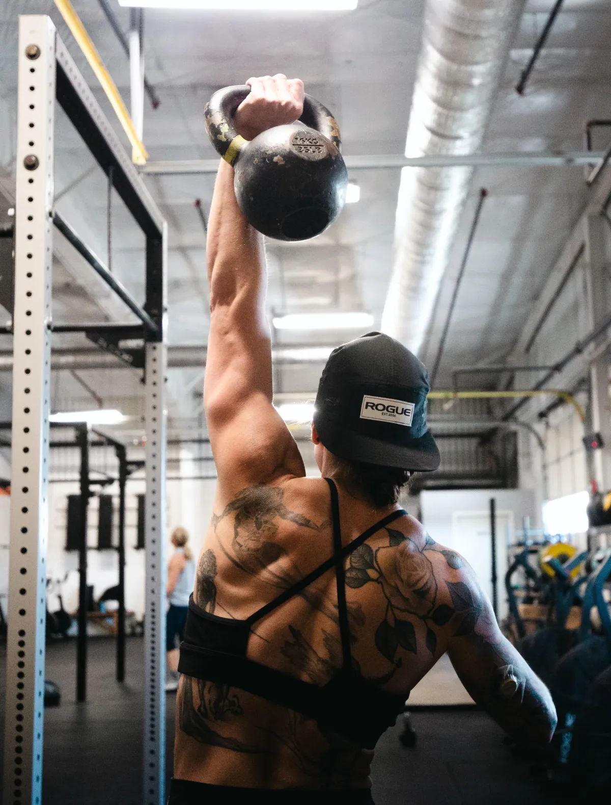
The Best strength and conditioning Workout In Conshohocken!
Get the results you’ve been looking for!
Since 2013, our full-time, career coaches have helped more than 3,000 people in Conshy get stronger, healthier, and more confident.
CrossFit Conshohocken isn’t just another gym — it’s 7,000 sq ft of energy, support, and results.
From your very first class, you’ll see why our members stay for the workouts — but love us for the community.

With 80+ 5-star reviews and the only money-back guarantee in town, you’ll know you’re in the right place.
Find the Right Class
For Your Goals
Whether you’re brand new to fitness or a seasoned athlete, our classes are designed to meet you where you are. At CrossFit Conshohocken, you’ll get expert coaching, proven workouts, and the support of a community that pushes you to succeed.
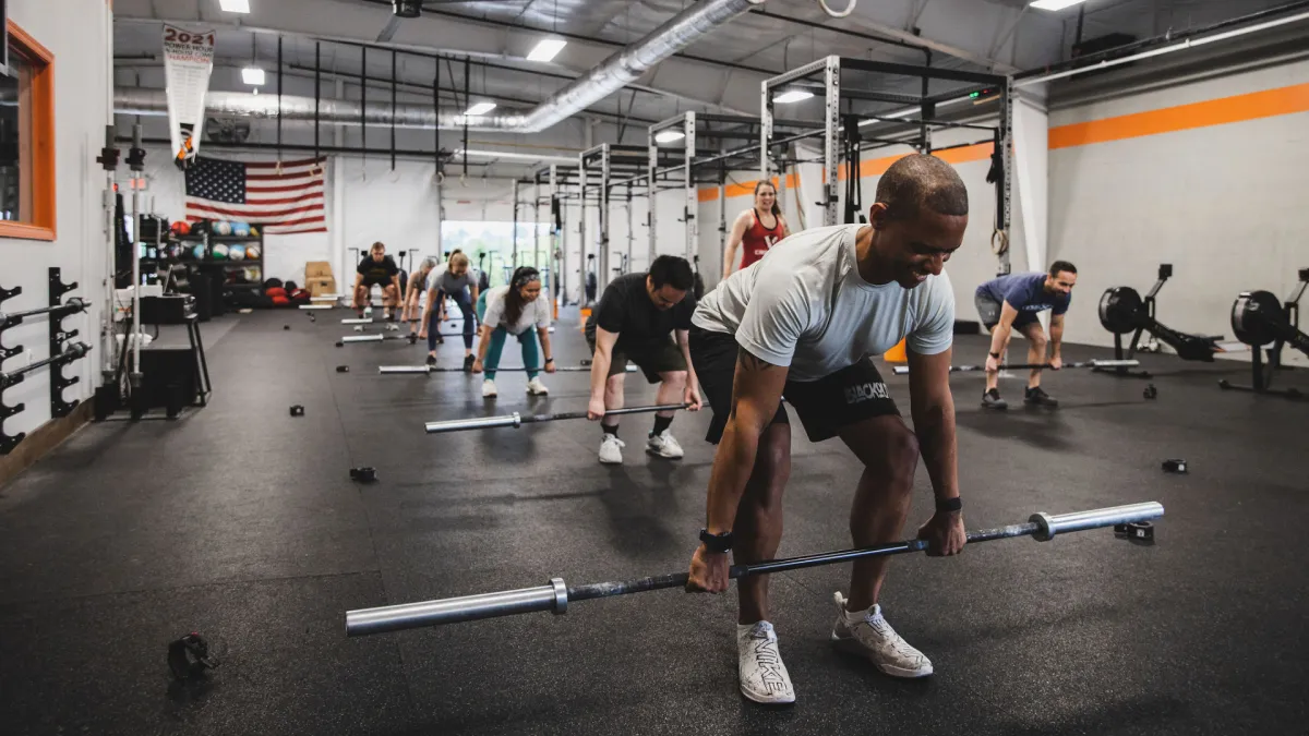
Adult Group Training
60-minute strength and conditioning sessions that challenge you, motivate you, and leave you feeling accomplished.
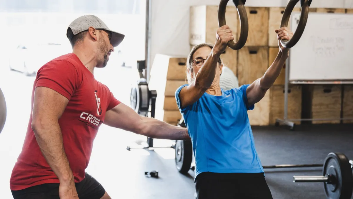
Personal Training
One-on-one coaching tailored to your goals, schedule, and fitness level — perfect for faster progress or special needs.
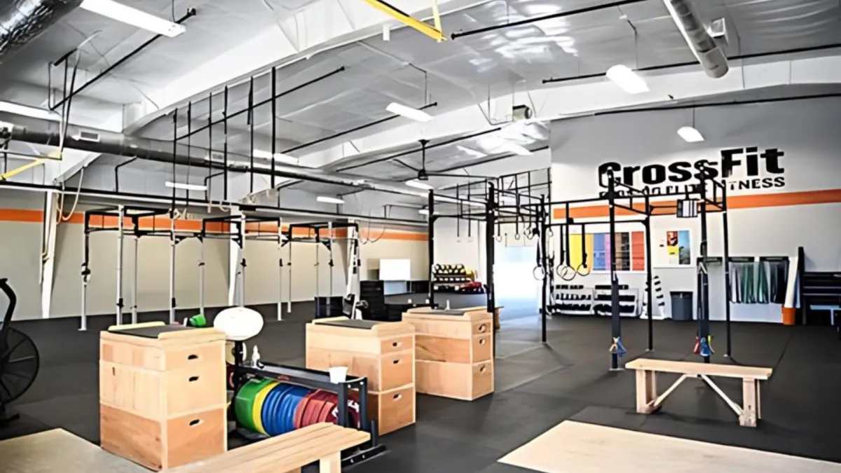
Open Gym
Train at your own pace with full access to our 7,000 sq ft facility, including “The Forge” for lifting and mobility work.
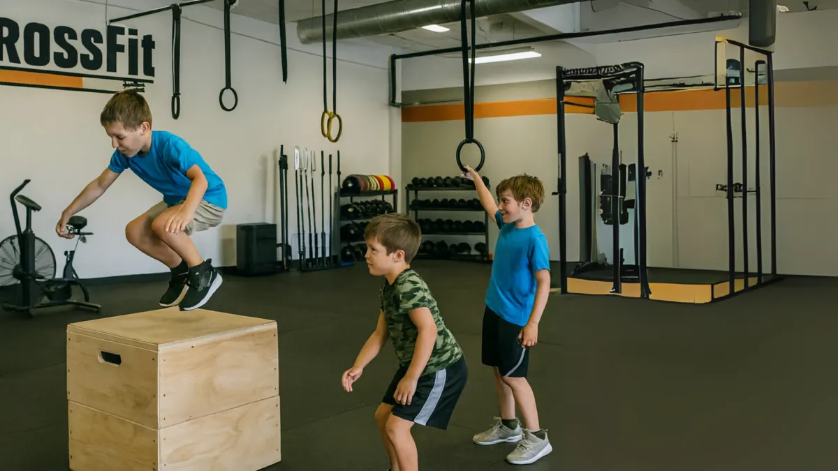
CrossFit Kids
Fun, safe, and engaging workouts designed to build confidence, strength, and coordination for the next generation.
Adult Group Training
60-minute strength and conditioning sessions that challenge you, motivate you, and leave you feeling accomplished.
Personal Training
One-on-one coaching tailored to your goals, schedule, and fitness level — perfect for faster progress or special needs.
Open Gym
Train at your own pace with full access to our 7,000 sq ft facility, including “The Forge” for lifting and mobility work.
CrossFit Kids
Fun, safe, and engaging workouts designed to build confidence, strength, and coordination for the next generation.
You've Got Goals. We've Got The Time.
Train On Your Schedule
Consistent Classes + Open Gym Through The Day
At CrossFit Conshohocken, your routine fits your life. Our 60-minute classes run morning, midday, and evening — coached by full-time professionals — with Open Gym available through the day. Whether you’re before work, on lunch, or after hours, there’s always a spot for you.
| Time | Monday | Tuesday | Wednesday | Thursday | Friday | Saturday | Sunday |
|---|---|---|---|---|---|---|---|
| 5:45 AM | CrossFit | CrossFit | CrossFit | CrossFit | CrossFit | ||
| 7:00 AM | CrossFit | CrossFit | CrossFit | CrossFit | |||
| 8:00 AM | CrossFit | ||||||
| 9:00 AM | CrossFit | ||||||
| 9:30 AM | CrossFit | ||||||
| 10:45 AM | CrossFit Kids | ||||||
| 12:00 PM | CrossFit | CrossFit | CrossFit | CrossFit | CrossFit | ||
| 4:30 PM | CrossFit | CrossFit | CrossFit | CrossFit | CrossFit | ||
| 5:30 PM | CrossFit | CrossFit | CrossFit | CrossFit | CrossFit | ||
| 6:30 PM | CrossFit | CrossFit | CrossFit | CrossFit | CrossFit |
CrossFit Testimonials
What Our Clients Say About Us...
Be inspired by the success stories of our community. From losing the office gut to feeling confident in a swimsuit, our members prove that with the right coaching and a supportive team, you can achieve more than you ever thought possible. At CrossFit Conshohocken, we’re more than just a gym — we’re a community that lifts you up.

Best Workout Ever Done!
Doug is super motivating and is constantly changing things up so I don't get bored. If you've been working out and not getting the results you want, give this a try, he offers a trial class for free so you've got nothing to lose and quite possibly the fitness level you've only dreamed of to gain!

Kristin
Petrelluzzi

Best Workout Ever Done!
Doug is super motivating and is constantly changing things up so I don't get bored. If you've been working out and not getting the results you want, give this a try, he offers a trial class for free so you've got nothing to lose and quite possibly the fitness level you've only dreamed of to gain!

Chelsea
Richardson

Gets you in shape FAST
If you’re looking for an extremely intense, dynamic, and personalized workout experience that gets you in shape FAST while having “fun”, Doug’s is the absolute best there is. I can honestly tell you, the workouts he puts on each day are amazing and can be tailored to fit your needs.

Anne
Lenihan
The Premier CrossFit Gym In Conshohocken, PA
Where To Find Us
For questions or to book your Free Intro, reach us here:
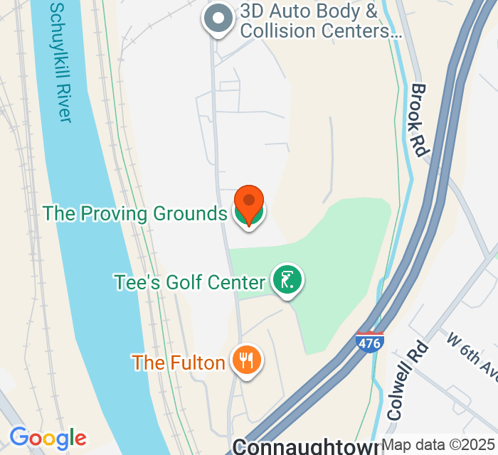
725 Conshohocken Rd, Unit D, Conshohocken, PA 19428
Whether you’re an early riser or an after-work warrior, our schedule makes it easy to train.
Open Gym is available throughout the day.
Frequently Asked Questions
Got questions? We've got answers!
Learn more about getting started, what to expect, and how we make sure your fitness journey is a success at CrossFit Conshohocken.
Do I need to be in shape to start?
Nope! Every workout is scaled to your level. Whether you’re brand new or a former athlete, our coaches make sure you feel comfortable and challenged at the same time.
What if I’ve never done CrossFit before?
Most new members start with a Free Intro Session and can take our beginner classes to learn the basics. We guide you step by step so you feel confident from day one.
How long are the workouts?
Classes run for 60 minutes — including warm-up, strength, conditioning, and cool-down. It’s the best hour of your day.
What makes CrossFit Conshohocken different?
At CrossFit Conshohocken, it’s more than just workouts — it’s expert coaching, proven experience, and a community that has your back. We’re the only dedicated CrossFit gym in Conshohocken, led by full-time career coaches who live and breathe this lifestyle. With over 12 years in business and thousands of members trained, we know how to help you stay consistent, see results, and actually enjoy the process.
How do I get started?
Simple — just book your Free Intro. You’ll tour the gym, meet a coach, and get a plan that fits your goals. No stress, no pressure.
Frequently Asked Questions
Got questions?
We’ve got answers!
Learn more about getting started, what to expect, and how we make sure your fitness journey is a success at CrossFit Conshohocken.
Do I need to be in shape to start?
Nope! Every workout is scaled to your level. Whether you’re brand new or a former athlete, our coaches make sure you feel comfortable and challenged at the same time.
What if I’ve never done CrossFit before?
Most new members start with a Free Intro Session and can take Fundamentals to learn the basics. We guide you step by step so you feel confident from day one.
How long are the workouts?
Classes run for 60 minutes — including warm-up, strength, conditioning, and cool-down. It’s the best hour of your day.
What makes CrossFit Conshohocken different?
We’re the largest CrossFit gym in the area with 7,000 sq ft of space, full-time career coaches, and the only money-back guarantee in town.
How do I get started?
Simple — just book your Free Intro. You’ll tour the gym, meet a coach, and get a plan that fits your goals. No stress, no pressure.

CrossFit Conshohocken helps everyday people build strength, confidence, and lasting results. Our expert coaches, high-energy workouts, and supportive community make fitness something you’ll actually look forward to.
Copyright © 2025. All Rights Reserved by CrossFit Conshohocken | Privacy Policy | Terms of Service
Gym Opening Time
Monday: 5:45 AM – 7:30 PM
Tuesday: 5:45 AM – 7:30 PM
Wednesday: 5:45 AM – 7:30 PM
Thursday: 5:45 AM – 7:30 PM
Friday: 5:45 AM – 7:30 PM
Saturday: 7:00 AM – 10:00 AM
Sunday: 9:30 AM – 11:45 AM
Copyright © 2023. Rights Reserved by Crush It Fit | Privacy Policy
Site Powered By Untapped Revenue


